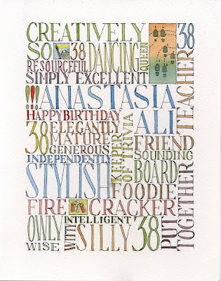


My good friend Ana has turned 38. This year, I thought I'd give her a birthday present, with a personal touch.
The following piece was based on a typographic experiment I tried in an earlier sketchbook spread. My feelings are a bit mixed about this piece. It's the first piece of art I've produced that will be put out there to the general public for them to judge (and I'm kinda nervous about that). Secondly, just from a technical point of view, some of the spacing is a bit off and that's what I see when I view this piece.
Any thoughts from the blogosphere?
(I hope Ana doesn't see this before our Saturday get together.)
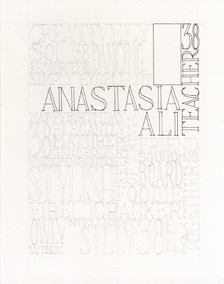
I've also included some process stages (I really liked how this looked just in black ink, actually).


3 comments:
The colour version looks great to me - perhaps working closely you can see faults but I can't!
I really love how you always mix typographic elements within your sketches. Now this pure one is wonderful, too. I am addicted to drawing letters and so to me it appears like it was quite fun to do. (i hope it was :) )Personnaly I like the noncolored one better, mainly because the colors are not very contrasting in terms of tonal value. So they somehow equalize it a bit too much for my taste. I could also imagine it would look great with different shades of black ink instead. But this is more or less nitpicking and somewhat about personal likings. I hope it was a success as a present. The spacing is nice as it is btw. and so is your blog :) regards
Wil; this is fabulous again! I would love to do a piece like this however, I think I would have a difficult time mapping out the words to fit.
I really love it!
Post a Comment