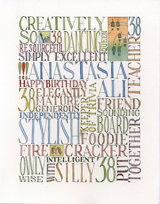

My good friend Ana has turned 38. This year, I thought I'd give her a birthday present, with a personal touch.
The following piece was based on a typographic experiment I tried in an earlier
sketchbook spread. My feelings are a bit mixed about this piece. It's the first piece of art I've produced that will be put out there to the general public for them to judge (and I'm kinda nervous about that). Secondly, just from a technical point of view, some of the spacing is a bit off and that's what I see when I view this piece.
Any thoughts from the blogosphere?
(I hope Ana doesn't see this before our Saturday get together.)
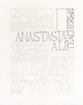
I've also included some process stages (I really liked how this looked just in black ink, actually).


